Vacation Rental Color Schemes: Bold Without the Chaos
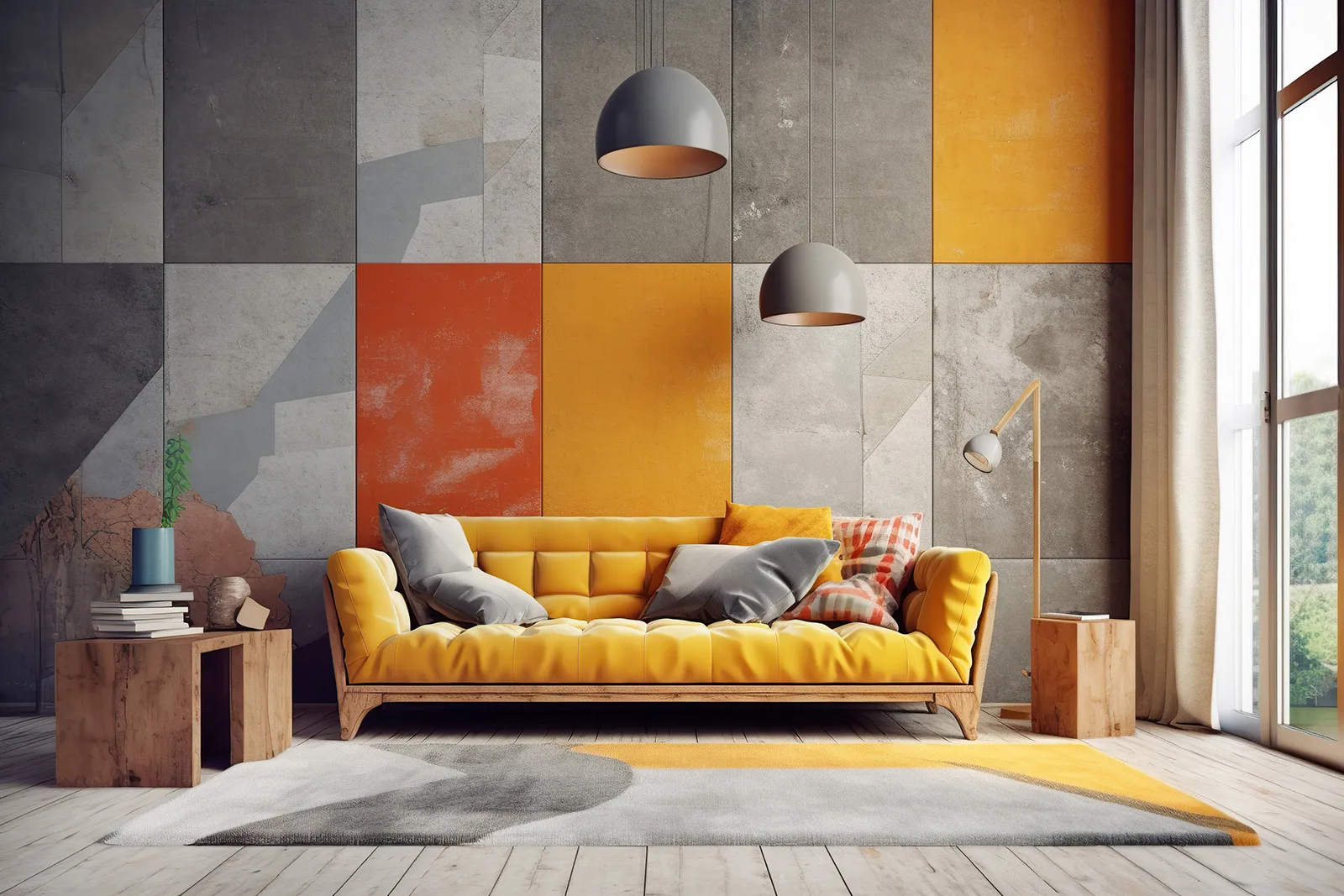
Color can bring so much personality, warmth, and life to a short-term rental. But too much of a good thing can quickly turn from “wow” to “whoa.” The trick to creating a great vacation rental color scheme is knowing where to go bold and where to pull back.
Don’t be afraid to use color in your rental. A few intentional choices can make your space feel welcoming, memorable, and pulled together without overwhelming your guests.
Add Color with Small, Intentional Accents
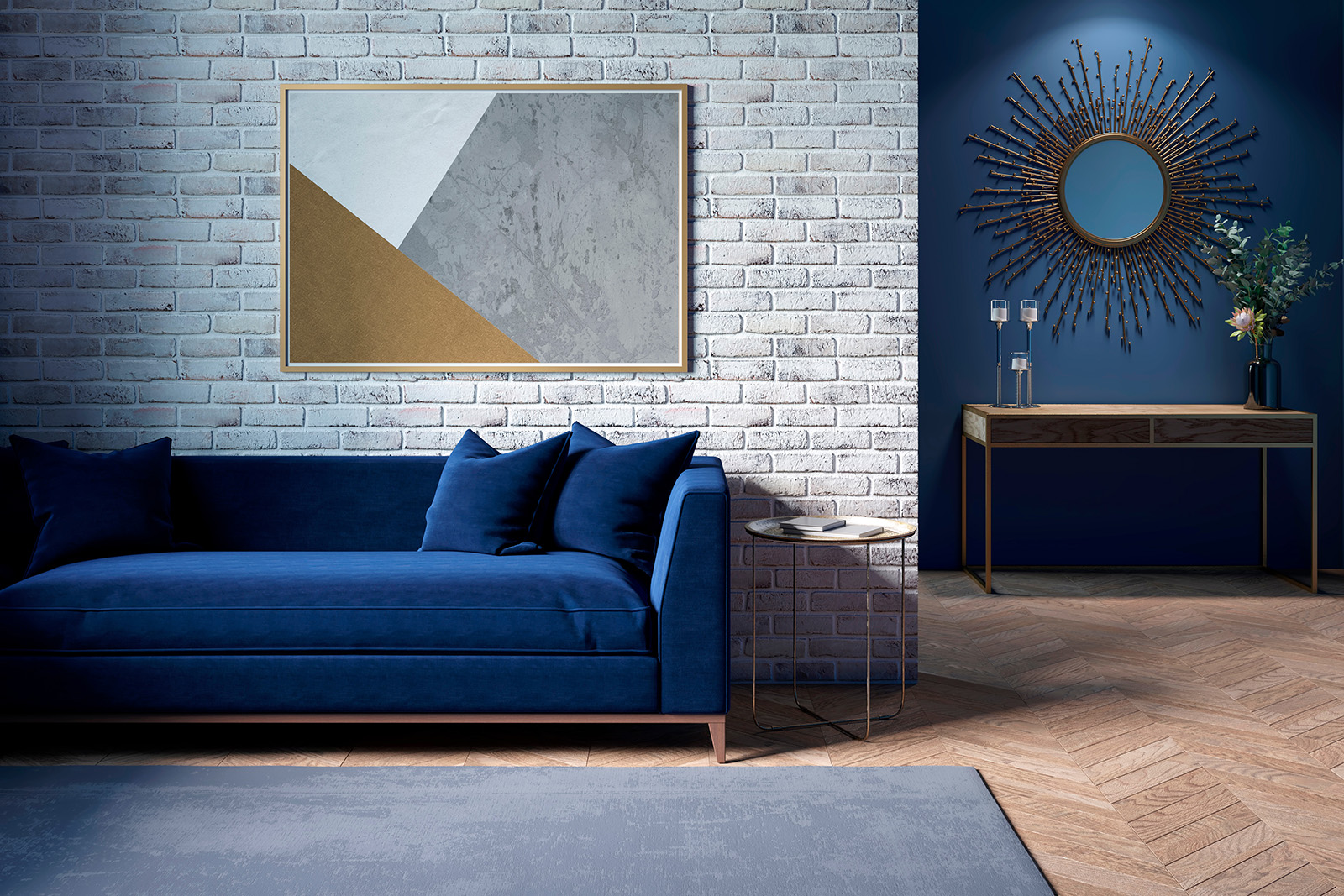
Slapping paint on a wall isn’t the only way to make an impact with color. Try incorporating vivid shades of color in small, intentional pops, like an eye-catching rug, stylish pillows, or artwork with bold splashes of color. For example, a pop of cobalt on neutral bedding or coral bar stools in an all-white kitchen adds energy without chaos.
Balance Bold Colors with Neutrals
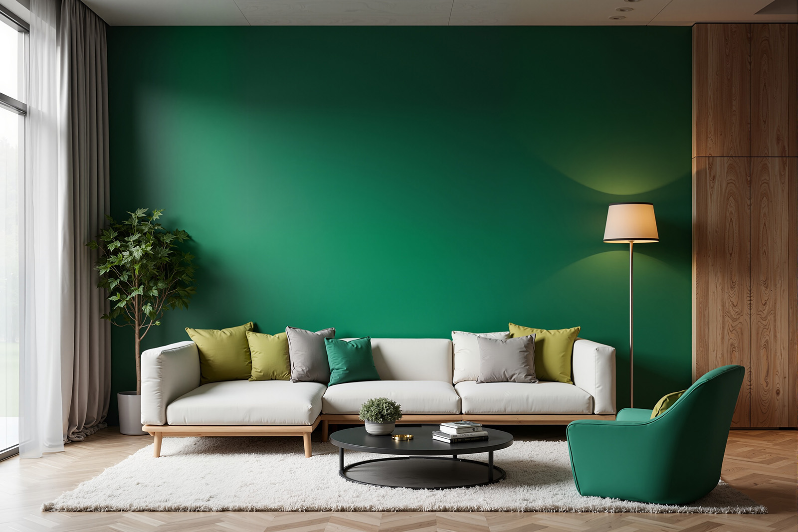
The secret is balance. Offset bright shades with neutrals like whites, grays, or natural wood tones. A bright emerald green wall looks amazing when paired with warm wood tones or creamy neutrals. The goal is to give your guests somewhere for their eyes to rest so they feel energized, not overwhelmed. Using bold color in transition areas (like entryways or hallways) can make an impression that doesn’t take over the whole space.
How to Build a Cohesive Vacation Rental Color Palette
You don’t need a complicated color scheme to create a space that feels pulled together. Start with a simple palette:
- One main color: Your foundation, often a neutral that works across larger surfaces.
- One supporting color: A complementary shade that adds depth through furniture, textiles, or finishes.
- One accent color: A bolder shade used sparingly in artwork, pillows, or decorative details.
For example, warm white walls, natural wood tones, and touches of deep teal can create a welcoming space with personality.
Repeat your accent color in a few spots throughout the room to make everything feel intentional rather than random. Not sure which colors fit your overall design direction? Take our Design Style Quiz to find a style that feels right for your rental.
Color should feel intentional, not accidental. Start with one bold accent and build from there. It’s much easier to add than it is to dial it back. Your guests will notice the confidence in your design and feel that same energy when they walk in the door. Remember, bold doesn’t have to mean risky, just cleverly placed!
Want to pull your entire space together? Our Room Refresh Playbook helps you make confident design choices without overcomplicating the process.
Happy Hosting!